Conversation post: Who Are We Building With? Inclusive UX Design and Websites on Race & Slavery: Suzanne W. Churchill
Full Name: Suzanne W. Churchill
Biographical Note: Professor of English at Davidson College, Suzanne Churchill is the founder and editor of the Index of Modernist Magazines (https://modernistmagazines.or
Email: suchurchill@davidson.edu
Institutional Affiliation: Davidson College
Title or Position (optional): Professor of English
In the conversation, “Who are we building for? Community, Power, and Generous Thinking in DH,” Kathleen Fitzpatrick encourages us to think “not just about who we’re building for, but also who we’re building with: how can we cultivate practices and processes that ensure that those communities are not just audiences for or users of our work, but are in fact full partners in its design and development?”
Nowhere is this question more urgent than in the work colleges and universities are doing to acknowledge their historical ties to race and slavery, an ongoing effort that has resulted in the design and development of public facing DH websites and archives. To list just a few:
- Colored Conventions Project, a collaboration between The University of Delaware and Penn State University;
- Georgetown University’s Slavery, Memory, and Reconciliation and Georgetown Slavery Archive
- The Princeton & Slavery Project;
- Dr. Hilary N. Green’s The Hallowed Grounds Project at the University of Alabama.
As DH practitioners build websites to document institutional histories of race and slavery, we should recognize that design is as crucial as content in the production and dissemination of knowledge. After all, knowledge is power, and how we design our websites influences the degree to which we consolidate or share institutional power. Aimi Hamraie argues that “built forms convey material rhetorics, which reveal cultural assignments of knowledge and power” (1), and the same is true for digital forms, especially those built by institutions of higher education. Knowledge is neither neutral nor objective, but “is social, relational, material, and spatially situated. Knowing both reflects and shapes the world. Knowledge, in other words, is a kind of design” (Hamraie 10).
Too often, design is seen as a last step in the creation of a DH website—something to consider after the knowledge has been produced, rather than inherent in knowledge formation. After the historians and archivists have gathered all the materials, organized the metadata, and written the scholarly interpretations, a designer is hired to build the website to present the information online. But as Johanna Drucker argues, the work of design actually begins much earlier: “The crucial interpretive moment is when you’re setting up parameters of what constitutes your data—not when you’ve gathered your data.” Because this moment determines what constitutes knowledge, it’s crucial to be inclusive in the project design, an imperative powerfully articulated by the Colored Conventions Project:
We affirm the role of Black people as data creators and elevate the ways in which Black conventions generated data and statistics to advance, affirm and advocate for Black economic and organizational success and access. We also recognize that data has long served in the processes and recording of the destruction and devaluation of Black lives and communities. We seek to avoid exploiting Black subjects as data and to account for the contexts out of which Black subjects as data arise. We seek to name Black people and communities as an affirmation of the Black humanity inherent in Black data/curation. We remind ourselves that all data and datasets are shaped by decisions about whose histories are recorded, remembered, and valued. (CCP Principles)
If we neglect design considerations in setting project parameters, we may inadvertently exclude, exploit, or devalue Black people and communities, thereby retrenching (or “e-trenching”) the very institutional biases and exclusions that we aim to overcome. Inclusive design “considers the full range of human diversity with respect to ability, language, culture, gender, age, and other forms of human difference” (“Philosophy”).¹ DH practitioners should commit to inclusive design from the initial conception of a project, to the forming of teams, gathering and interpretation of data, and all the way to the creation of the public-facing interface.
It is the public-facing interface that I want to focus on here, in order to make a case for what I’m calling inclusive UX (user experience) design. According to the World Wide Web Consortium (WC3) inclusion “is about diversity, and ensuring involvement of everyone to the greatest extent possible,” and usability “is about designing products to be effective, efficient, and satisfying” and “includes user experience design.” Combining inclusion and usability, inclusive UX design seeks to engage and involve a diversity of users to the greatest extent possible in the ongoing production of knowledge.
To demonstrate what I mean by inclusive UX design, I will compare two websites dedicated to exploring histories of race in America: Colored Conventions Project (2012-2020) and The Princeton & Slavery Project (2020). I will focus on visual rhetorics in order to show how UX design can influence users’ understanding of history as “a sociohistorical process” (“what happened”), as well as their involvement in “a story about that process” (“that which is said to have happened”) (Trouillot 2).
At first glance, the two homepages look very similar: polished, professional, well-organized, and intuitively navigable, with the logo located in the top left corner, in line with a primary header menu, and a smaller, secondary header menu positioned at the upper right. Both adopt a limited color palette (black, white, red, and orange) and feature a historical, hand drawn illustration. Both deploy a parallax layout to encourage readers to scroll down to discover additional content, and punctuate the offerings with brightly colored, rectangular buttons encouraging users to “explore,” “see,” “view,” “visit,” “read more,” and “learn more.”
[Interactive image. Please click and drag the center slider left and right.]
But a closer examination of the two pages reveals a world of differences in terms of inclusive UX design. The Color Conventions Project (CCP) invites users to participate in a dynamic, multifaceted, ongoing storytelling project, while the Princeton & Slavery Project (PSP) encourages exploration of more static, authoritative, and finished historical record.
Images
Let’s begin with the illustrations that generate the visual interest on each homepage. These images tell very different stories about who and what is important.
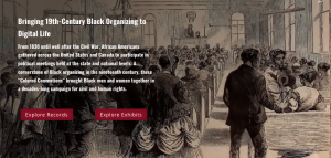
The CCP page features a 19th-century pen & ink sketch of a Colored Convention. The meeting hall is full of well-dressed Black women and men. We see the crowd from behind, as if we just have entered and are waiting for the family in the right foreground to get seated so that we can join in. The illustration aligns our focal point with the center aisle, guiding our eyes through the crowd to the front of the hall, beckoning us to proceed back in time to participate in history. The illustration thus enacts the text overlay, “Bringing 19th-Century Black Organizing to Digital Life.”
In contrast, the blended image on the PSP homepage is more static and less immersive.
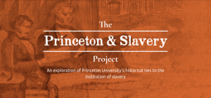
A pencil sketch of three, well-dressed white men (founding father types) is overlaid upon a 19th-century manuscript, presumably the official document they are authoring. A woman fades into the background at the right, hunched over with her back to us, perhaps taking notes on the historic occasion. Both the drawing and handwriting are difficult to read because of the low contrast, semi-transparency, and a dark orange tint. History in this image is remote, hazy, male-dominated, and white—or literally, orange, evoking the imprimatur of Princeton’s official colors.² The text overlay, “The Princeton & Slavery Project: An exploration of Princeton University’s historical ties to the institutions of slavery,” implies that the exploration has already been undertaken—the stories already told.
Menus & Hierarchies
Despite a similar layout, the menus of the CCP and PSP sites likewise invite strikingly different levels of participation. Whereas the menu-driven structure of the CCP site gives users access to most of the content in a single click, the layered page structure of the PSP site requires users to click through multiple pages to get to desired content, thus requiring more effort to dig back into history.
The CCP’s primary menu offers multiple possibilities for user participation, sorted into five categories, three of which have additional dropdown menu options. The first item, “Conventions,” welcomes users at various levels of expertise, including options to learn “About the conventions,” explore “Digital records,” and “Submit records.” These choices invite users to see themselves as fellow historians and scholars, with opportunities to learn, contribute to research, and join in the process of telling stories and developing new historical knowledge. Midway through the primary menu, the “Teaching” category appeals to educators, providing sample writing assignments, research guides, and classroom modules. The page explains “How to Become a Teaching Partner,” while “The Seeking Records Classroom Module invites participating faculty and students to join us in the exciting process of locating historical documents related to the Colored Conventions and presenting them to the public for the very first time.” The next item in the menu, “News & Events,” broadcasts information about online and in person events, while the expansive dropdown menu under “About CCP” identifies the operating principles, team, committees, a collective project CV, contact information, and information on how to use the site. The “About CCP” offerings both describe and enact the project’s commitments to diversity, inclusion, and “collective organizing principles and values.”
In contrast to this diverse array of choices, the PSP offers only three main menu options: “Stories,” “Primary Sources,” and “Multimedia,” which take users to pages displaying interpretive essays, archived artifacts, and various maps, visualizations, and videos—all completed stories about history. To learn about PSP, users must turn to the secondary menu in small print at the very top of the page. This menu hierarchy subtly implies that Princeton University needs no introduction, that the contributors are less important than the knowledge they produce, and that the interactive content (News & Events, For Teachers, and Talkback) is subordinate to the elegant display of acquired knowledge. The CCP’s secondary menu, on the other hand, changes regularly: when last I checked, it was encouraging users to get involved in political action, but today, it advertises the forthcoming Colored Conventions Book. The changing menu signals the site’s dynamism—its responsiveness not only to history but also to current events.
Featured Exhibits & Stories
Both sites offer a range of “Featured Exhibits” and “Featured Stories,” and in this area, the differences are more subtle, yet still significant. Whereas the CCP featured exhibits uphold the principle that “Colored Conventions were produced through collectives rather than by the work of singular figures or events,” the PSP exhibits emphasize individual achievements, suggesting that history is the work of great men whose stories are recounted by academics.
The CCP presents the exhibits side-by-side in a grid that gives prominence to historical images, all of which include two or more Black women and men.
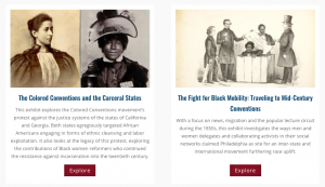
The exhibit titles are theme and movement focused, e.g. “Equality before the Law,” “The Meeting that Launched a Movement,” and “The Fight for Black Mobility.” These themes connect Black history to the current events highlighted in the “News” section beneath, which encourage users to “Mobilize NOW for a Future Where Black Lives Matter” and emphasize ongoing activism: “#DivBLK: Principles in Action During a Website Migration.” Each exhibit gives credits to multiple curators, editors, and supporters.
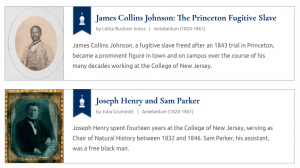
The Featured Stories and Visualization on PSP are organized in a vertical list, anchored by two historical portraits of men. Less than half the size of the featured images on CCP, these formal portraits do not generate the same degree of human interest. The exhibit titles also highlight significant Black and white individuals (“James Collins Johnson” “and “Joseph Henry and Sam Parker”) and include by-lines of the authors of their stories. The colored flags indicating the category of each exhibit evoke the heraldry of university coats of arms—a seal of authority.
About/Contributors
The “About” page is an important yet often undervalued page on a DH website. Supplying information about the project, creators, and contributors, this page is crucial to communicating a project’s commitments to transparency, openness, and power sharing. Located in the primary menu under “About CCP,” the Team page displays the header, “Introducing the Colored Conventions Project Team,” which conveys excitement and emphasizes collaboration. The page includes headshots and assembles a diverse group of contributors on a dynamic page layout organized according to roles in the project. To find out who created the PSP site, you have to do more digging, choosing “About Princeton & Slavery” in the secondary header menu. This link leads to a page with a menu of options — Overview, Project History, Authors, Resources, and How to Cite. The Authors page presents an alphabetical list of names; clicking on the accordion arrow beneath each name reveals a bio and link to that author’s stories.
The PSP focus on individual credentials and accomplishments strikes a contrast to the more accessible CCP Team page. To PSP’s credit, the alphabetized list of names breaks down hierarchies of knowledge and expertise by putting undergraduates, graduate students, and faculty contributors on an equal footing, whereas CCP groups them according to their status. Yet there are good arguments for grouping undergraduate work together, so that they can see themselves as part of a valued collective and not feel overshadowed by more accomplished contributors.
Web Accessibility: Who’s Invited to the Table?
Lest I seem too hard on the PSP, I want to acknowledge the valuable, important work the project does to document Princeton’s historical connections to slavery by making primary texts and scholarly interpretations publicly accessible online. The PSP also has an important advantage over the CCP. Tested on WebAIM’s WAVE evaluation tool, the PSP homepage turns up no errors—a high bar of achievement in terms of web accessibility for users with disabilities. The CCP homepage turns up 15 errors. Despite its inclusive UX design, the CCP site may inhibit some users with disabilities from fully participating in the ongoing project of racial justice and scholarship.³
When I mentioned the accessibility issue to Dr. Hilary Green, she noted that “disability has sometimes been a way to dismiss the racial part,” and asked, “Whose accessibility matters more?” (Conversation). To reply that “all accessibility matters” seems comparable to saying “all lives matter,” when in fact Black people’s access to higher education, production of knowledge, and inclusion in American history has historically been limited, suppressed, or prohibited, and we have not yet achieved equity.
Rather than weighing one constituencies’ access over another, we might follow Jutta Treviranus’ lead and embrace inclusive design principles that “consider our complex, adaptive and entangled world and our inter-dependencies” (Part I). After all, some Black users are disabled, and most users will experience disability at some point in their lives. Inclusive design is “design for all,” but with particular attention to people who have and continue to be marginalized, excluded, and dehumanized. Trevinaranus, Director of the Inclusive Design Research Centre and a professor at the Ontario College of Art and Design University, attests that “inclusive design plans and facilitates change. Change in environments, products, services, and processes, but also social change. By stretching the responsiveness and adaptability of the designs we live with, it supports a diversity of human knowledge, skills, and perspectives” (Part III).
Inclusive UX design involves a diversity of people in the ongoing process of creating and sharing knowledge. It helps us avoid a charity model of knowledge giving “where the powerful, privileged and well-resourced deign to assist and give of their wealth to the less privileged, less fortunate and weaker” (Treviranus, Part I). Instead, Treviranus recommends a “system that is designed to respect and include diversity and human variability at every nested level. We need a society where it is possible for people, with the full range of human difference, to participate and contribute” (Part I). We can work toward such a society by designing our DH websites to enable all people, especially those who have historically been denied the opportunity, to build with us and participate in rewriting American institutional histories. For Hilary Green, rewriting these histories involves including Black communities in the design process, as well as creating a place for the descendant community: “All people need to be at the table.”
Notes
- In “Disability, Universal Design, and the Digital Humanities,” George H. Williams makes a related argument that “the digital humanities community should adopt a universal design approach,” which he defines as “the idea that we should always keep the largest possible audience in mind as we make design decisions, ensuring that our product serves the needs of those with disabilities as well as those without.” While I wholeheartedly agree, I prefer the term “inclusive design” to “universal design,” which W3C says is synonymous, but has a different history and connotation. The term “universal design,” Williams explains, was coined by architect Robert Mace, and refers to design for all, “not specifically on people with disabilities, but all people.” Whereas the term “universal” connotes an impossible ideal, “inclusive” calls for practical attention to who is included in both the making and use of our designs. In the context of institutional efforts to recover their histories of race and slavery, I worry that calls for “universal design” can too easily slip into design for a white majority, standard, or norm. Sure, everyone can access the site, but does everybody feel welcome at the table and included in the conversation?
- “The evolution of Princeton’s colors began in 1866. That year, George Ward, a member of the Class of 1869, proposed the color orange in reference to the Prince of Orange, William III of the House of Nassau.” https://princetoniana.princeton.edu/things-princeton/colors-shields
- Full disclosure: the DH site I co-designed, Mina Loy: Navigating the Avant-Garde (https://mina-loy.com/) turns up 9 errors, despite repeated efforts to fix them and reassurances from our technical designer that the site meets accessibility standards.
Works Cited
- Colored Conventions Project, https://coloredconventions.org/. Accessed 7 Nov. 2020.
- Drucker, Johanna. “Radical Remediation.” Re-Mediating the Avant-Garde: Magazines and Digital Archives Symposium, 25-26 October 2013, The Blue Mountain Project, Princeton University Library, Princeton, NJ. Keynote lecture.
- Georgetown Slavery Archive. https://slaveryarchive.georgetown.edu/. Accessed 16 Nov. 2020.
- Green, Hilary N. “Hallowed Grounds Project.” https://hgreen.people.ua.edu/hallowed-grounds-project.html. Accessed 20 Nov. 2020.
- ———-. Conversation with Suzanne Churchill. 10 Nov. 2020. Associate Professor of History in the Department of Gender and Race Studies and co-program director of the African American Studies program at University of Alabama, Dr. Green is the Vann Professor of Ethics in Society at Davidson College for the academic year 2020-’21.
- Hamraie, Aimi. Building Access: Universal Design and the Politics of Disability. University of Minnesota Press, 2017.
- “Philosophy.” Inclusive Design Research Centre, https://idrc.ocadu.ca/about/philosophy/. Accessed 20 Nov. 2020.
- Princeton & Slavery Project. https://slavery.princeton.edu/. Accessed 7 Nov. 2020.
- Slavery, Memory, and Reconciliation. http://slavery.georgetown.edu/. Accessed 20 Nov. 2020.
- Treviranus, Jutta. “The Three Dimensions of Inclusive Design: Part One.” Medium, 10 July 2018, https://medium.com/fwd50/the-three-dimensions-of-inclusive-design-part-one-103cad1ffdc2. Accessed 7 Nov. 2020.
- —————. “The Three Dimensions of Inclusive Design, Part Three.” Medium, 15 Apr. 2018, https://medium.com/@jutta.trevira/the-three-dimensions-of-inclusive-design-part-three-b6585c737f40. Accessed 7 Nov. 2020.
- Trouillot, Michel-Rolph. Silencing the Past: Power and the Production of History. Boston, MA: Beacon Press, 1995.
- W3C Web Accessibility. “Accessibility, Usability, and Inclusion.” Web Accessibility Initiative (WAI), https://www.w3.org/WAI/fundamentals/accessibility-usability-inclusion/. Accessed 10 Nov. 2020.
- Williams, George H. “Chapter 12: Disability, Universal Design, and the Digital Humanities.” Debates in the Digital Humanities. The Regents of the University of Minnesota, 2012. https://dhdebates.gc.cuny.edu/read/untitled-88c11800-9446-469b-a3be-3fdb36bfbd1e/section/2a59a6fe-3e93-43ae-a42f-1b26d1b4becc#ch12. Accessed 7 Nov. 2020.
Suzanne W. Churchill